
The Design tab styles how the configurator looks on your storefront. Styles are saved as themes you assign per product, so different product lines can have different looks.
Start from a preset
Four built-in presets give you a designed starting point in one click:
- Minimal — quiet chips, tight spacing, follows your store's colors
- Boutique — serif type, round fabric swatches, generous whitespace
- Bold — card choices in a grid, checkmark selection, full-width button
- Night — for dark storefront themes: soft borders, amber accent, dark tooltips
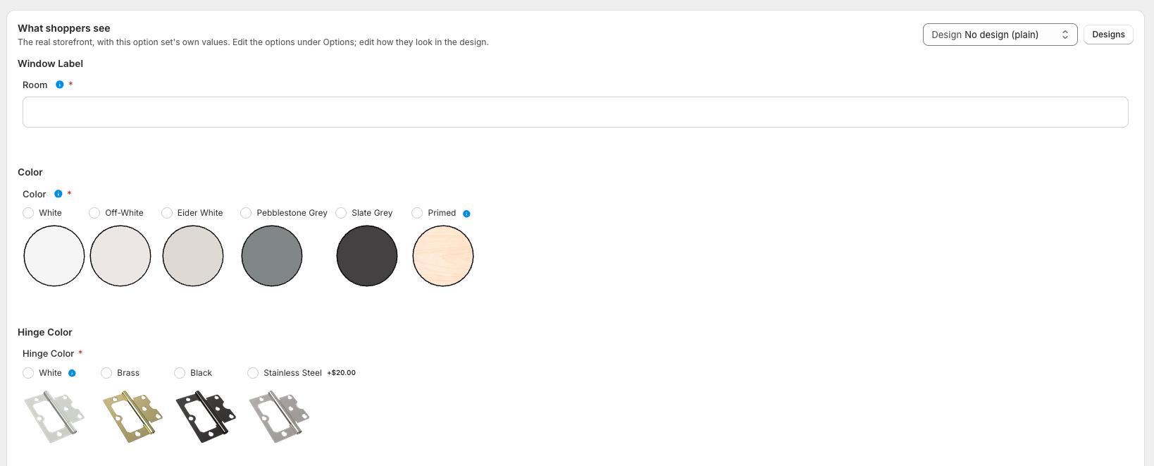
Click one, then tweak. The live preview on the right uses the exact styles your storefront ships, so what you see is what shoppers get.
What you can control
- Typography — font (match your store theme, pick a preset stack, or enter your own), text sizes, section title style
- Colors — accent, borders, backgrounds, prices, error messages, the price bar, and the Add to cart button (color and text color)
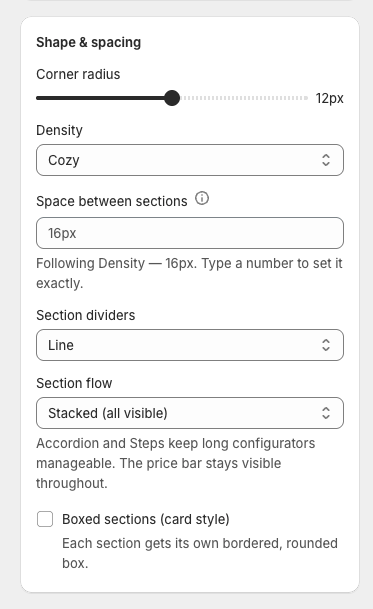
- Shape & spacing — corner radius, density (compact / cozy / roomy), section dividers
- Section flow — show all sections stacked, collapse them into an accordion, or walk shoppers through steps one at a time. Accordion and Steps keep long configurators manageable; the live price and Add to cart stay visible throughout. Accordions can start with the first section open, all open (shoppers collapse as they go), or all collapsed — and headers can show the current pick, like "Color — Pavement".
- Boxed sections — give every section its own bordered, rounded card (with its own corner radius), like the premium configurators on big blinds stores. Works with any flow, and pairs especially well with the accordion.
- Choices — chips, swatches, images or cards; swatch shape and size; how the selected choice is marked (outline, tinted fill, or a checkmark badge); label position
- Click to enlarge — adds a magnifier to image choices so shoppers can inspect a fabric up close before choosing
Beyond the presets
Density gives you compact, cozy and roomy, which are a good start and a bad finish. Where a preset is close but not right, type the number:
- Space between sections, in pixels
- Inside padding of a boxed section — separate from the space between boxes. One number used to drive both, so asking for roomier cards also pushed them apart; now you can have one without the other
- Box background, box border colour and border weight. Set the weight to zero for a card that is its background alone. The border used to borrow the choice border colour, so softening the outlines around your swatches also softened the cards holding them — they are separate now
- Step numbers — in Steps flow the numbered circles are the only thing telling a shopper how far through they are, so they take a circle colour, a number colour, and both sizes
The Add to cart panel takes a border weight too, beside the colour it always had.
Per option set, not just per shop
A design theme is your shop's house style. But a made-to-measure blind and a gift-message add-on live in the same shop and want opposite answers about whether a section is a card, how far apart the steps sit, and whether the shopper walks them one at a time.
Every setting above can also be set on one option set: open it, go to the Design tab, and use Shape & spacing for this option set.
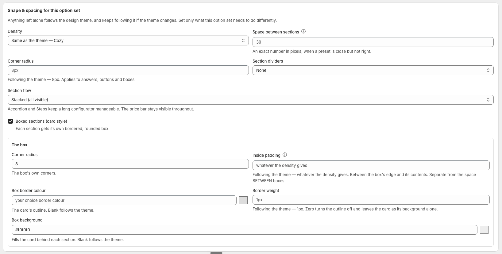
Anything you leave alone follows the design theme — and keeps following it when the theme changes. That is the whole reason a theme exists, so each control says in words what it will do untouched ("Same as the theme — Roomy") rather than sitting blank and making you guess. Clearing a field puts it back to following.
Explaining a disabled answer
When a rule switches an answer off, the shopper needs to know why or they read it as broken. Where the reason goes is per option:
- Beside the name — suits chips
- A strip along the bottom — suits cards. The strip stays at full strength while the rest of the card fades, because it is the one part that has to be readable. It has its own background and text colour
- On hover — leaves the layout untouched, and the only option that fits a swatch
A photo that follows the shopper
A section can carry a section photo: a picture that takes over the product gallery while a shopper is reading that section — a measuring diagram while they enter sizes, a hinge close-up while they pick one. It fades in as they scroll and hands back when they move on.
Set it on the section, not the option: a per-option picture would change every few hundred pixels of scroll, which reads as flicker rather than as a guided tour. Desktop only, and a chosen answer's own image always wins over it.
Tooltips
Most fields in the app carry a small i you can hover for an explanation of what the setting does and when you would reach for it. On the storefront, every question and answer can carry its own tooltip for shoppers — with pictures, which is the easy way to explain what a "Z-frame" is.
A tooltip is hidden until hovered, so it is for nice-to-know detail. Copy a shopper needs in order to choose belongs in an answer's Description, which is always visible when answers are drawn as cards.
Assigning a theme
On the Products page, each connected product has a Design dropdown. Pick a theme, or leave "Default style" to inherit your store theme's look.
Per-option overrides
The theme sets the default look; any option can override it with its own Display choices as setting in the template editor — e.g. cards for fabrics but a plain dropdown for hardware.
The escape hatches
At the bottom of the theme editor there are Custom CSS and Custom JavaScript fields. These are for developers — everything above them covers the vast majority of stores, so if you're not sure what these do, you don't need them.